Wow, I can’t believe it’s been this long. A quick catch-up: I spent the last few years since my last book writing a new novel, off and on, and trying to decide how I was going to pursue my newly discovered love of writing.
Ultimately, I buckled down and finished my latest book, tentatively titled Whistle Switch. I feel like I’ve fundamentally improved as a writer since The People’s Killer, and I think anyone that reads both will find the changes obvious. I started out writing my first novel on a whim, to prove I could, and assumed that given the effort I put in, that was my level writing ability. I can say with high confidence that that was naïve, and that just the act of writing alone has helped me grow my ability (I know, duh!).
Anyway, I feel so confident in Whistle Switch, that I’m going to pursue traditional publishing. Based on some cursory research, I expect to have a number of failures on this path, so at very least, I can use it as a lesson to teach my kids about perseverance and patience in the face of adversity. Hopefully, it’s a lesson about how this pays off…
Part of this new path is doing a better job of supporting my writing with other activities, such as this blog, so we’ll see if I’m able to keep up this commitment.
Thanks to anyone still paying attention after all this time.
This is a quick lesson in double-checking your manuscript in Amazon’s previewer before accepting — particularly for the paperback edition.
Before publishing, I spent (literally) dozens of hours proofreading and formatting my manuscript. I had ordered proof copies from Amazon and discovered some errors, including a significant mistake where my paperback manuscript was aligned left (right ragged), not justified. It was surprising how normal this looks in Word, but how alien it looks printed. I fixed this, and some other minor spelling/grammar errors that I identified.
As a side note, I found that the free version of Grammarly found a number of issues that Word had not picked up on. I highly recommend doing at least one final pass with Grammarly. Interestingly, Grammarly didn’t like the way I use commas to dictate the flow of a LOT of my sentences, but I ignored their advice. I like my sentences to have my particular cadence!
Anyway, I published my book officially on June 6, 2021 and immediately ordered a couple of author’s copies. As another side note, if you’re only ordering a copy or two, you might as well just order regular copies instead of author’s copies, as the cost will be lower and you’ll get them faster! Lesson learned there.
When I got my copies, I opened the book, and immediately noticed two glaring, amateurish errors:
First, a paragraph was indented too far. After scanning over my entire novel, I only found one other instance of this, so I guess it was dumb luck that I happened to open right to this one. I went back to my original manuscript in Word, and found the errors there as well. The paragraph and formatting settings revealed nothing, so I couldn’t easily fix it. I even tried setting the cursor in front of the first incorrectly indented letter, backspacing to lose the carriage return, and then hitting enter again, but still got the same strange behavior. Ultimately, I solved this by using the format painter to copy nearby formatting, and painting over the error.
How did this even happen?
Second, the scene break indications (the *** symbols on their own line) were not centered, but were left-aligned. This must have occurred when I fixed the justification, but I don’t know how I got here. This issue was particularly lame looking, like I hadn’t just spent a zillion hours perfecting the format. At least it was an easy fix.
No! Bad alignment, bad!
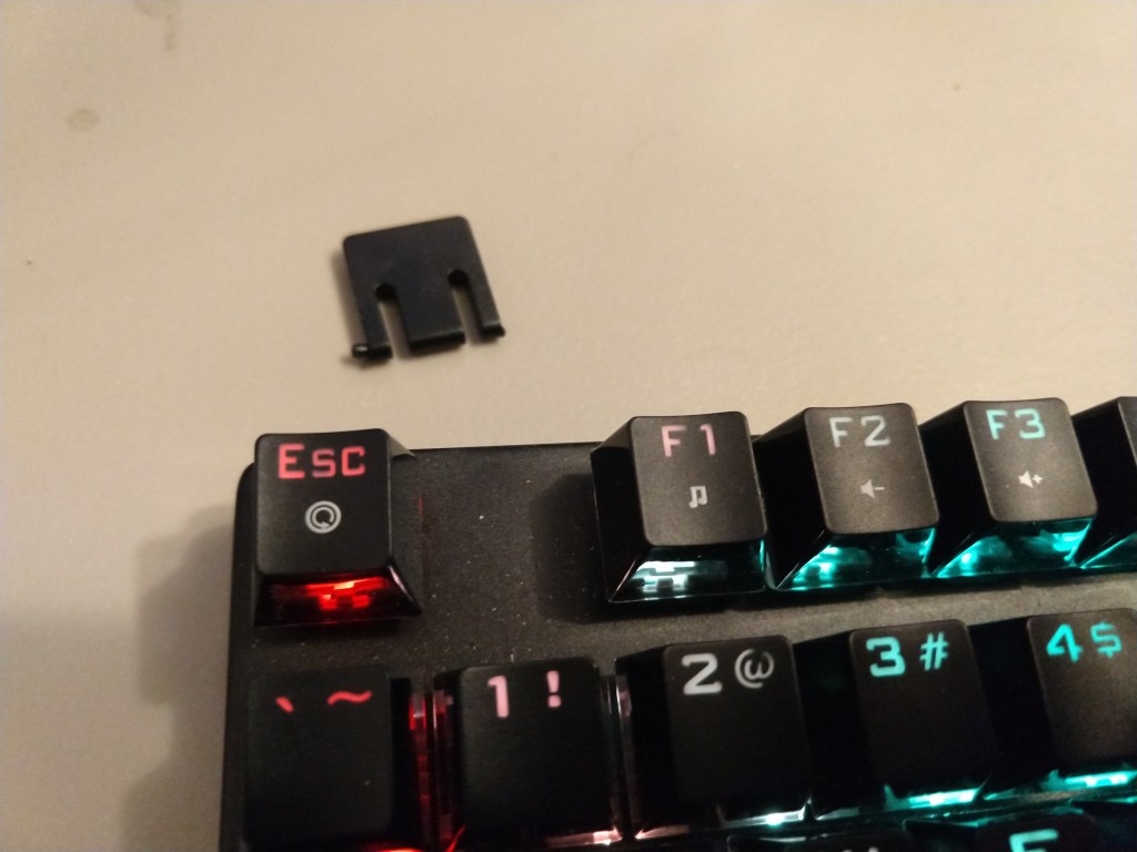
I would be lying if I said I wasn’t filled with rage when I discovered these mistakes (I went down to my computer, hit ctrl-f (for find) so hard that I broke my keyboard. Yes, it was stupid, and yes, my finger really hurts. I fixed the issues, republished, and took a moment to cool down. I actually thought about buying replacement copies for those few that had already purchased the paperback edition. That’s how much it bothered me that these errors were escaped, out in the real world — a record of my failure of discipline.
My broken foot. I suppose I should be glad my “f” key survived.
Then, it occurred to me that the few people that had purchased the paperback copy of my novel now had a rare, special copy of the book. These copies will be exceptionally valuable after I become a world-famous author! Good news for you lucky few. 🙂
In short, don’t lose your temper over simple, fixable mistakes. I’ve had to drop the other foot down on my keyboard, so I’m typing this post on a more flat, level surface than I’m used to.
Also, review your paperback preview in Amazon in earnest, even if you’re sure it’s perfect.
It’s official: The People’s Killer is now published and available on Amazon. Click “Purchase” above to get my book in either Kindle or paperback forms. Please let me know what you think, by clicking “Contact Me” — send me an email or a message.
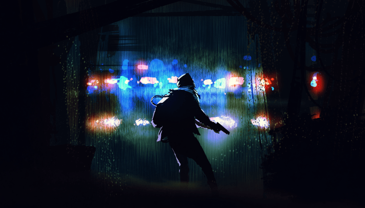
First things first: the original art for the cover of The People’s Killer, which I’ll be using as an example, is licensed to me from: Tithi Luadthong/ShutterStock.com
Note that this is less the steps you should take, and more a short summary of my particular process.
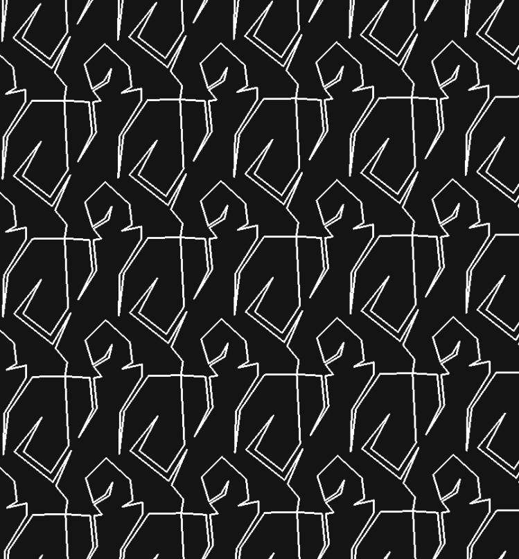
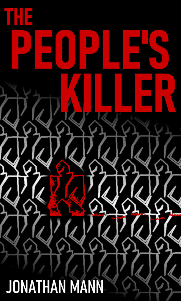
Originally, I thought I’d create my own artwork for the cover. Ever since I was a kid dreaming of writing a book, I also dreamt of illustrating that book. I had an idea for a tessellation image of a man, where one stood out as different than the rest (not unlike my story).
My original tessellation image
Not bad for a first run, so I spent a considerable amount of time enhancing it. I personally really like gimp for editing images, so I used it for most of my image manipulation here.
My final version with the tessellation idea
I really liked the result, and it has kind of an old-school thriller book cover feel, but I didn’t feel like it was quite professional enough.
Plan B:
I looked at fiverr.com to see if someone could put together a cover design that was professional and cheap. There were tons, and the delivery time was suspiciously fast. Obviously they weren’t creating original art so quick for so cheap, and I was leery about where the images were coming from, so I looked elsewhere (don’t want an angry artist writing me emails, or worse, suing me).
I found a site that made fantastic-looking covers. They only use each design once, to help ensure you don’t see your cover on another book, but they licensed the images that they started with in such a way that someone else could still end up with the same starting artwork on their book cover. In the site’s fine print they mentioned ShutterStock.com, so I went there to check them out.
It turns out ShutterStock.com is a great site full of wonderful art and photos (and more), that you can license to use commercially. I figured I could create my own cover if I had a solid image to start with. I sifted through their available royalty-free art and photos, and found a good starting image. I then purchased a license package (I believe the cheapest was 2 images for $30), and downloaded the highest-quality copy I could.
Original, raw (fantastic!) artwork image
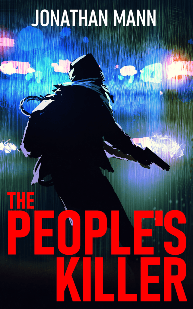
So far so good. I adored the artwork, and it fit pretty well with my story and the overall vibe I was going for. One thing I’ve been conscious of through the design process was that I wanted the final cover to look really solid small, and black and white. This is to ensure that it looks appealing even on a Kindle device. To that end, I was messing with the colors, and found that cranking up the color and darkening the darks to an inky black really made the image pop. Also, the figure in the original image has long hair (which didn’t fit with my story!), so I edited it out.
Color enhanced, long hair removed
Next, I rebuilt my Title and Author text from my first cover effort. Amazon is pretty picky about their uploaded image sizes, dpi, and file size, so it took several tries to get the paperback version and the Kindle version just right. Notice that for the paperback version, I darkened the back cover section a bit and edited out a few of the bright police lights to make the back cover text stand out as much as possible.
Final paperback coverFinal Kindle cover
This process looks straightforward and simple here, but I spent copious hours getting it just right. One of my favorite things about writing for myself and designing my own book covers, is that it allows me give in completely to my perfectionism. I don’t have a deadline, I don’t have a boss, I can take as long as I want, and completely exhaust myself making my end product align exactly with my vision.
This is my first post. I’ve just set up the website with WordPress in some final preparations for launching my new novel: The People’s Killer.
I’m not completely sure what I’m going to fill these posts with, but I may do some that show my processes as a new author navigating the world of self-publishing.