The first thing to understand about taking reference pictures with a model is that you take a LOT of pictures, in all kinds of lighting, positions, and angles. Even with a pretty clear idea in your head of what you want, the process has a mind of its own (similar to writing the character!), and you have to let it guide you to a natural, superior outcome.
Here are some interesting shots, that ultimately did not work out, but helped us find what we ultimately wanted:
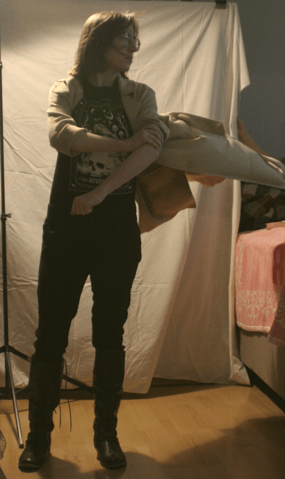
This one was cool, but a little stiff. Plus, felt like it was more of a “magic” stance and less of a “superhero” stance. The coat’s not bad here (this is with a leaf blower).
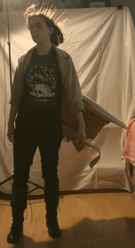
This one is good, but a bit passive. It’s almost wistful…
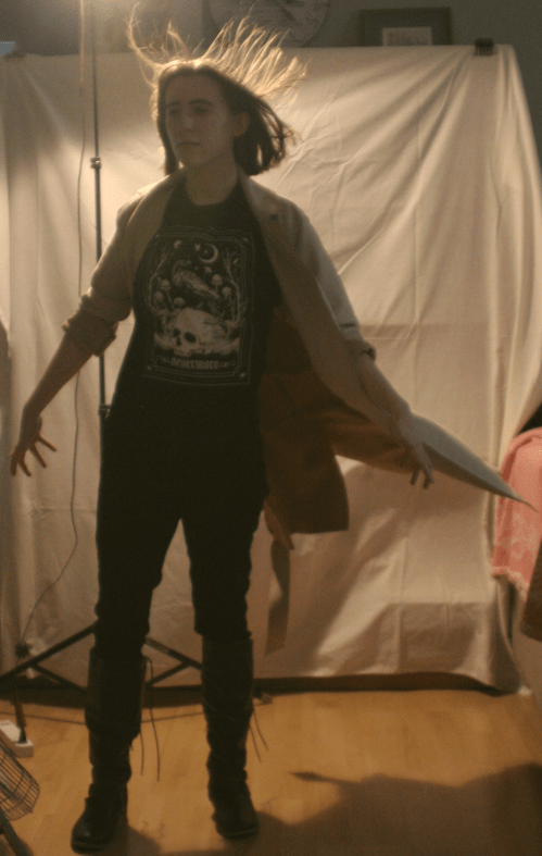
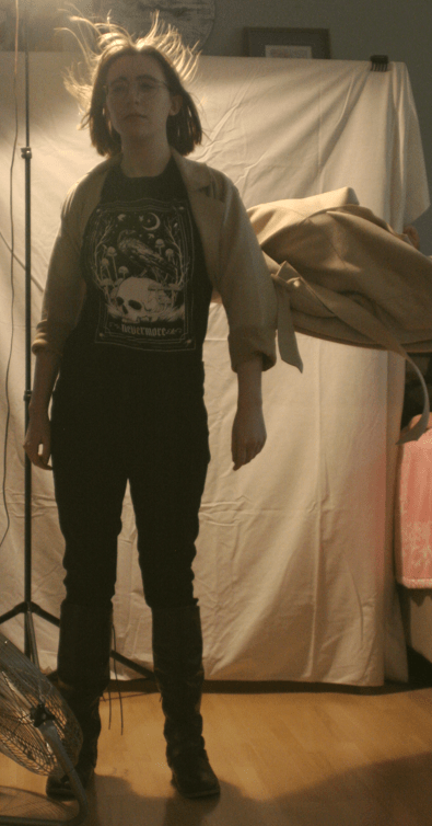
We’re getting closer. This pose is more purposeful, and the coat is doing…something, but this angle and position present some challenges for what we were ultimately going for.
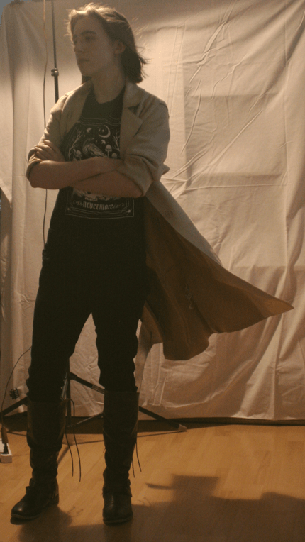
This gave us the idea of folding her arms in a sort of tough-girl pose. This led to a number of shots, two of which we used parts of:
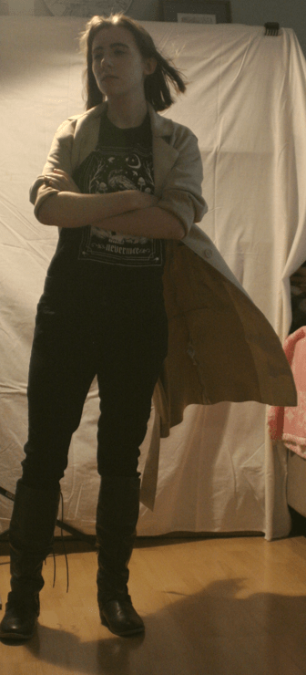
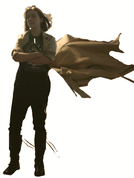
We copied the top (above) of this shot into our composite, and we copied the bottom of this shot (below) in as well.
Ultimately, we took the best coat action from a completely different set of shots and used it (below).
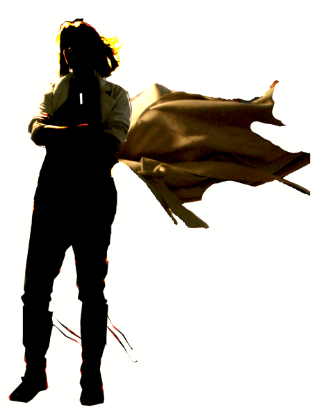
Below is the composite. Note that this is just for reference for the artist, so is fairly rough. Also, I didn’t have a prop for the trench whistle that Alexis wears, so we just digitally drew one in on the fly. After the shoot, our model pointed out that the laces were not really “blowing in the wind” like everything else, so we did a little manipulating there for it.
I had the idea of making the image a bit more stylized, wanting something along the lines of Frank Miller’s work on the Sin City comics (and later, movies). Below is a brilliant example of his imagery. Severely blocked-out characters and backgrounds, with a single, solid color for impact.

https://uk.pinterest.com/pin/arthouse-sin-city-art–476959416767387589
Inspired by this, we tried cranking the contrast and adjusting some brightness thresholds to get this (below):
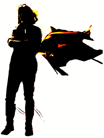
Now, we’re getting somewhere. Carrying on the Sin City inspiration, we merged the “normal” coat back over the top of the high-contrast image, to get this (below):
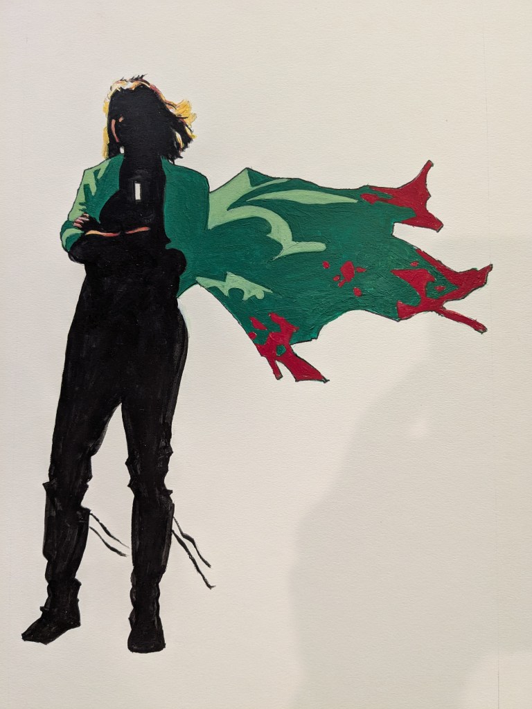
Good enough for reference. The character has a confident pose, the coat is genuinely going nuts behind her, and the stylized image is beginning to pop. The artist took this, and several notes from what I wanted to see in the final image, and went to work. They did some experimenting and produced a rough, which frankly (no pun intended), blew me away (I swear, still no pun intended). It was Alexis! Check out the rough below:
Epic. We discussed a few minor tweaks, and the artist is now working on the full version. I can’t wait to share it!

You guys are amazing. Fun to see process.
Sent from my iPhone
LikeLiked by 1 person